Warm Neutral Palettes
Explore the latest trends for warm neutral exterior paint color palettes. Find the perfect look for your home's architecture and discover complementary materials.
See this on your own home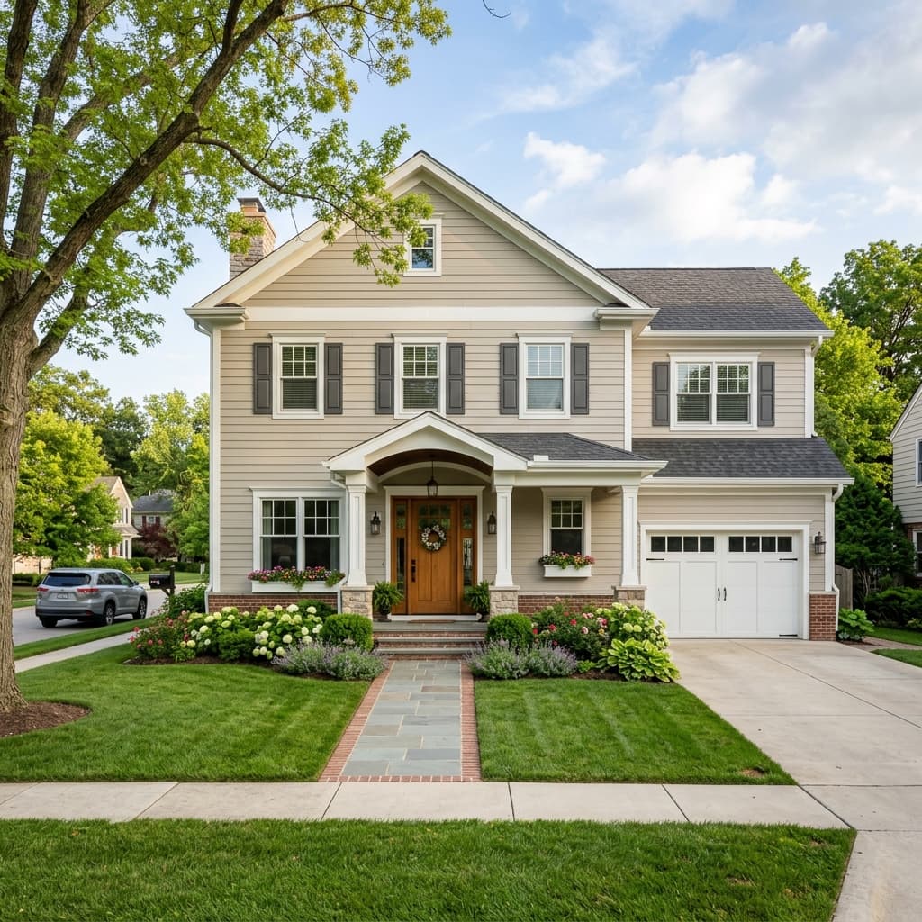
Design Considerations
What you need to know before choosing warm neutral palettes.
Pros
- Timeless appeal that rarely goes out of style
- Excellent for neighborhood HOA compliance
- Appeals to the widest range of home buyers
Cons & Challenges
- Can look flat in overcast lighting
- May blend in too much with neighboring homes
- Requires contrasting trim to pop
The Timeless Appeal of Warm Neutral Palettes
When it comes to exterior painting, trends come and go rapidly. What is wildly popular today may look dated in five years. However, one color palette remains eternally popular and consistently delivers the highest return on investment: warm neutrals.
Warm neutrals—encompassing creamy off-whites, soft beiges, and taupe-leaning greiges—offer a sophisticated, inviting aesthetic that appeals to almost every home buyer.
Why Warm Neutrals Win
The primary reason warm neutrals are so successful is their versatility. Unlike stark, cool whites (which can look blinding in the sun and cold in the winter) or dark charcoals (which can feel imposing), warm neutrals strike a perfect balance.
They reflect sunlight beautifully, keeping the home cooler in summer, while the warm undertones (yellow, brown, or red) make the house feel grounded and welcoming. Furthermore, warm neutrals are incredibly forgiving. They pair effortlessly with natural stone, brick, wood accents, and almost any roof color, making them the safest bet for a full exterior repaint.
Executing the Perfect Palette
To execute a warm neutral palette without it looking "boring" or "builder-grade," you must rely on contrast and texture.
- The Main Body: Choose a complex greige or cream, such as Sherwin Williams Alabaster or Benjamin Moore Pale Oak.
- The Trim: Do not use the exact same color for the trim. Instead, use a noticeably lighter, crisper white to define the architectural lines of the house.
- The Accents: This is where the palette comes alive. Because the body of the house is neutral, you can use bold accents. A natural mahogany front door, copper gutters, or dark bronze window frames will instantly elevate the home from standard to luxury.
Avoiding the "Muddy" Look
The biggest mistake homeowners make with warm neutrals is failing to test the color in different lighting. A color that looks perfectly beige on a paint chip in the store might look muddy green in the shade of a large oak tree, or excessively pink during a sunset. Always paint a 3x3 foot test swatch on both the north and south sides of your home before committing to the full palette.
Authoritative Sources
Exterior Vibe relies on objective data and industry standards. For more technical information regarding exterior painting materials, consult these trusted organizations:
Frequently Asked Questions
Common questions about warm neutral palettes and exterior visualization.
How can I see what my house looks like with warm neutral palettes?
You don't have to guess based on small samples. You can use Exterior Vibe's free AI visualizer to upload a photo of your house and instantly see warm neutral palettes applied to your exterior in seconds.
Is there an app to test exterior painting on my home exterior?
Yes, Exterior Vibe is a free web application that allows you to test different exterior painting options on your actual home. Simply upload a photo and the AI will apply the new materials, taking lighting and rooflines into account.